Simple People search SPFX Webpart in 10 minutes
This article describes steps to get a simple yet powerful search-based SPFX Webpart for SharePoint Online or 2019 up and running. To accelerate development and minimize own coding effort we shall use PNPJS library for data access and React together with Office UI Fabric for user interface.
Step 0
The prerequisites and tools needed are described in Microsoft Docs.
Shortly, you need to have the following installed on your development PC:
- NodeJS 10
- Visual Studio Code
- Run the following from command-line to install yo, gulp and SharePoint templates
- npm install -g yo gulpo
- npm install -g @microsoft/generator-sharepoint
After going through the checklist above, we create an empty Webpart Project, following the instructions from Microsoft
One difference to default settings, proposed by the manual above, is that we choose React when prompted for JavaScript Framework and use „PeopleSearch“ as Webpart name.
Step 1
A small issue must be taken care of at this step. Microsoft uses TypeScript version 2.4.2 to compile SPFX Webparts by default, which is pretty old and might cause compilation errors on new dependency libraries. To fix this, please install the latest version from command-line by running:
npm install typescript@latest
After the NPM is done installing latest Typescript, please replace the contents of your projects “gulpfile.js” with the following snippet:
'use strict';
	const typeScriptConfig = require('@microsoft/gulp-core-build-typescript/lib/TypeScriptConfiguration');
	typeScriptConfig.TypeScriptConfiguration.setTypescriptCompiler(require('typescript'));
	const gulp = require('gulp');
	const build = require('@microsoft/sp-build-web');
	build.addSuppression(`Warning - [sass] The local CSS class 'ms-Grid' is not camelCase and will not be type-safe.`);
	build.initialize(gulp);
Further step would be to deploy new Webpart to SharePoint. This is necessary, as development Workbench offer no real data connection with SharePoint data. Deployment options are described at Microsoft Docs
Step 2
Now when you got your Webpart shown on SharePoint page, it can be customized to do something useful. First we need to configure data sources. As long as we decided to use PNPJS library to access SharePoint API, it must be installed from npm repository:
npm install @pnp/logging @pnp/common @pnp/odata @pnp/sp --save
then go to
.\src\webparts\peopleSearch\PeopleSearchWebPart.ts
and add the following import directive to reference PNP objects from your project.
import { sp } from '@pnp/sp';
On the next step PNP must be bound to current SharePoint context. Unlike in Classic Mode, Modern UI does not offer global variable „_spPageContextInfo“, therefore context should be assigned during the initialisation step. To achieve this, please locate your Webpart Class, extending BaseClientSideWebPart Type and add the following method:
public onInit(): Promise<void> {
	  return super.onInit().then(_ => {
	    sp.setup({
	     spfxContext: this.context
	    });
	  });
	}
Details to PNPJS data binding can be found here https://pnp.github.io/pnpjs/getting-started/#using-pnpsp-setup
Now when data source is ready, we can proceed with UI implementation. Go to
.\src\webparts\peopleSearch\components\PeopleSearch.tsx
And add the following imports to the header:
import { SearchBox } from 'office-ui-fabric-react/lib/SearchBox';
	import { sp, ISearchResult, SearchQueryBuilder } from '@pnp/sp/presets/all';
	import '@pnp/sp/search';
Direct after the imports we can declare simple interface to pass our search results to React renderer:
export interface IPeopleSearchState {
    searchResult: ISearchResult[];
}
And update component definition with this interface:
export default class PeopleSearch extends React.Component < IPeopleSearchProps, IPeopleSearchState > {...
Step 3
Now we are ready to delete default webpart markup from render() method of our component and paste following markup to present search box in webpart:
return(
	  <div className = { styles.peopleSearch } >
	    <div className={styles.container}>
	      <div className={styles.row}>
	        <div className={styles.column}>
	          <SearchBox onChanged={this.searchChanged} />
	        </div>
	      </div>
	    </div>
	  </div >
	);
This code contains Office UI Fabric component to render nice search input box. Non-existing method „this.searchChanged“, which is referred from this search box, will be performing actual search in SharePoint. Now we can insert this method to component definition:
public searchChanged(text: string): void {
	  if (!text) {
	    this.setState({ searchResult: [] });
	  } else {
	    // do search
	    const q = SearchQueryBuilder(`${text}*`)
	      .sourceId('B09A7990-05EA-4AF9-81EF-EDFAB16C4E31').rowLimit(20);
	    sp.search(q).then((data) => {
	    this.setState({ searchResult: data.PrimarySearchResults });
	    });
	  }
	}
This method accepts text, typed in a search box, as parameter. When the search box is empty – component state is updated with accordingly empty result set. If anything has been typed in by the user – SharePoint Search is called with appropriate query. The search data source ID is configured to People Search, maximal count of results set to 20.
At this point we can deploy updated webpart to SharePoint and ensure search box is presented properly on the page:
Step 4
By reaching this paragraph we have the complete back-end functionality ready. Upon data entry our search box queries SharePoint server for matching user profiles, though they are not getting displayed yet.
To have search results visible within our component, add the following html code after <SearchBox /> tag in render()-Method of our component:
<div className={styles.resultdiv}>
	  {this.state.searchResult.map(item => {
	   return (
	    <div className={styles.resultrow}>
	     { item['PictureURL'] ?
	     <img src={item['PictureURL']} alt={item['PreferredName']}></img> :
	     <img src='/_layouts/15/images/PersonPlaceholder.96x96x32.png'    alt={item['PreferredName']}></img>
	     }
	     <a href={item['EditProfileUrl']}><h3>{item['PreferredName']}</h3></a>
	     { item['Department'] ? <p>{item['Department']}</p> : undefined }
	     <p>{item['JobTitle']}</p>
	     { item['WorkPhone'] ? <p>{item['WorkPhone']}</p> : undefined }
	     { item['WorkEmail'] ?
	     <a href='mailto:{item["WorkEmail"]}'>{item['WorkEmail']}</a> : undefined }
	     <div className={styles.clear}></div>
	    </div>
	  );
	  })}
	</div>
And a little styling to PeopleSearch.Module.scss
.resultdiv {
  position: absolute;
  background: white;
  z-index: 255;
  width: 434px;
  .resultrow {
    color:black;
    padding:3px;
    border-bottom: solid 1px #e0e0e0;
    border-left: solid 1px #e0e0e0;
    border-right: solid 1px #e0e0e0;
    &:hover {
      background-color: #f0f0f0;
    }
    h3 {
      margin:3px 0 3px 0;
    }
    a, p {
      display:block;
    }
    p {
      margin: 0;
    }
    img {
      float: right;
      margin:2px;
      max-height: 48px;
    }
  }
}
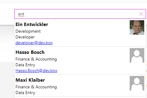
Now the results are connected to UI and after typing in some query, webpart will be showing formatted search results like below:
Well, that’s it! Now it is time to take a break, grant yourself a little chocolate and let webpart work alone further 🙂
For those interested comes a source code of the complete project.


